Internet Explorer 7 Beta
Internet Explorer 7 beta is out. Get it here.
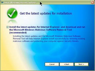
The killer features are: Tabbed browsing, RSS feeds, More security, the usual popup blockers and something called the "Microsoft Windows Malicious Software Removal Tool Thingy" !! With such a cool name it's bound to win back the millions who migrated to firefox. Firefox may have tabbed browsing and rss and security and what not, but it dont have no MWMSRT.
Observe the gradient of colors. The setup app is a riot of colors and large icons of tick marks and credit cards with locks on it. Even the next/back buttons are redesigned.
Coming to the user experience part, the interface's clean.. most of the buttons (which were never used anyway) are gone. There's no edit this page in notepad button anymore. Interface's clean and looks like firefox with an aqua skin.
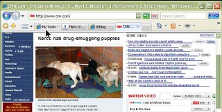
The GO button is an arrow and it transforms into the refresh button. Next and previous are where they're supposed to be. Favorites is upfront with a PLUS sign which is ADD to favs.
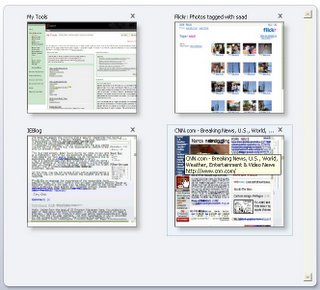 One cool feature (which means as-yet-unseen-in-firefox) is the thumnailing of the open tabs. Which shows a snapshot of all the pages in different tabs. One bad thing is until a page is done loading it shows as a blank page in thumbnail view. You cant surf in thumbnails, clicking anywhere reverts to normal view. Actually, there IS a plugin for firefox that does this, but I havent used it yet. It shows thumbnails on mouseover on tabs.
This thing is probably on the same lines as the stacking windows in 3D for Windows Vista. Cool things which probably wont be used much because MS designers cant get it out of there heads that PEOPLE DONT HAVE 20 WINDOWS OPEN AT THE SAME TIME. Hope I'm wrong, I like the 3D stacking thingy, and I'll probably use it quite a lot (for 10-15 days) when I get Vista.
One thing I liked about IE7 was the RSS experience. It has a add feed button which lights up if the site you're visiting has a feed. The subscribed feeds go next to the favs, but the reading experience is like a new page with the IE rss control panel over it. The background's a nice grey gradient like thingy.
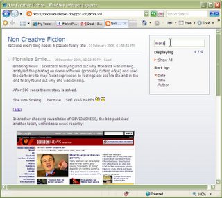 The panel let's your sort according to date/author etc and the search box is a nice addition. Like the RSS experience. For now I'm sticking to my Bloglines feeds though.
So... it's nice. Most of the changes were long overdue anyway. I dont think any firefox guy is gonna shift anytime soon. The new FF has drag and drop tabs, which is quite addictive... and IE7 is fine.. for sites which still dont support Firefox (Like Citibank and my Intranet).
So download the new IE7Beta... take back the web from Firefox who took the web back from IE. And use the Microsoft Windows Malicious Software Removal Tool Thingy freely... just make sure it doesnt remove windows itself.

The killer features are: Tabbed browsing, RSS feeds, More security, the usual popup blockers and something called the "Microsoft Windows Malicious Software Removal Tool Thingy" !! With such a cool name it's bound to win back the millions who migrated to firefox. Firefox may have tabbed browsing and rss and security and what not, but it dont have no MWMSRT.
Observe the gradient of colors. The setup app is a riot of colors and large icons of tick marks and credit cards with locks on it. Even the next/back buttons are redesigned.
Coming to the user experience part, the interface's clean.. most of the buttons (which were never used anyway) are gone. There's no edit this page in notepad button anymore. Interface's clean and looks like firefox with an aqua skin.

The GO button is an arrow and it transforms into the refresh button. Next and previous are where they're supposed to be. Favorites is upfront with a PLUS sign which is ADD to favs.
 One cool feature (which means as-yet-unseen-in-firefox) is the thumnailing of the open tabs. Which shows a snapshot of all the pages in different tabs. One bad thing is until a page is done loading it shows as a blank page in thumbnail view. You cant surf in thumbnails, clicking anywhere reverts to normal view. Actually, there IS a plugin for firefox that does this, but I havent used it yet. It shows thumbnails on mouseover on tabs.
This thing is probably on the same lines as the stacking windows in 3D for Windows Vista. Cool things which probably wont be used much because MS designers cant get it out of there heads that PEOPLE DONT HAVE 20 WINDOWS OPEN AT THE SAME TIME. Hope I'm wrong, I like the 3D stacking thingy, and I'll probably use it quite a lot (for 10-15 days) when I get Vista.
One thing I liked about IE7 was the RSS experience. It has a add feed button which lights up if the site you're visiting has a feed. The subscribed feeds go next to the favs, but the reading experience is like a new page with the IE rss control panel over it. The background's a nice grey gradient like thingy.
 The panel let's your sort according to date/author etc and the search box is a nice addition. Like the RSS experience. For now I'm sticking to my Bloglines feeds though.
So... it's nice. Most of the changes were long overdue anyway. I dont think any firefox guy is gonna shift anytime soon. The new FF has drag and drop tabs, which is quite addictive... and IE7 is fine.. for sites which still dont support Firefox (Like Citibank and my Intranet).
So download the new IE7Beta... take back the web from Firefox who took the web back from IE. And use the Microsoft Windows Malicious Software Removal Tool Thingy freely... just make sure it doesnt remove windows itself.
» Post a Comment